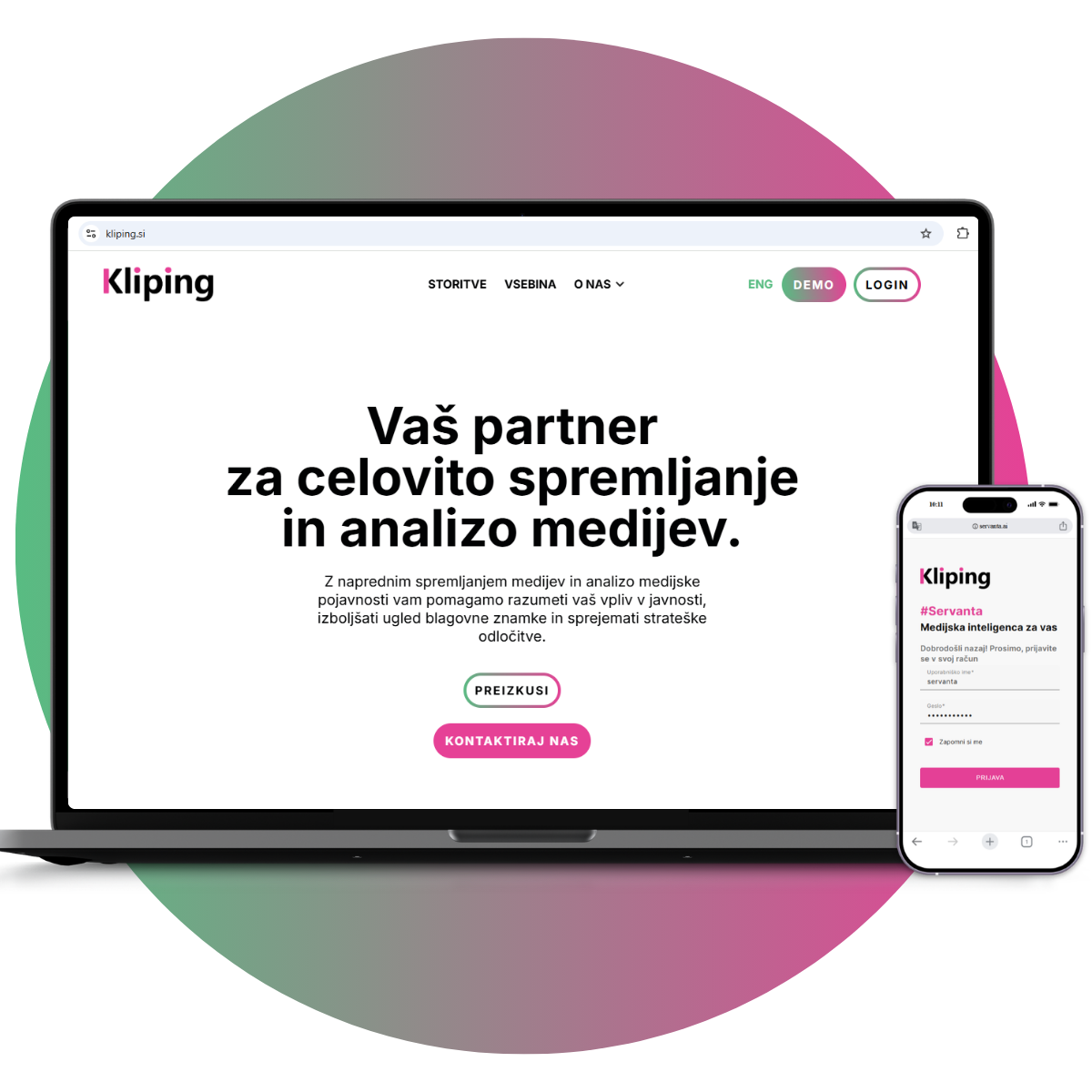
In recent years, we have invested heavily in development, service upgrades, and improvements to the user experience. One of the most important innovations is our new platform, Servanta, a modern media intelligence platform that responds to the needs of today’s communicators. It combines artificial intelligence with human expert support, which also captures very well our view of the future of media monitoring. Simply collecting media mentions is no longer enough today.
Communicators need overview, context, timely insights, and support in understanding what media presence truly means. Kliping has never been merely an archive of publications or a daily overview of media mentions. Our value has always been based on accuracy, responsiveness, expert judgment, and relationships with clients.
This is precisely why we did not want the redesign to be a complete departure from our existing identity. Kliping remains Kliping. Our core mission is not changing: we want to provide clients with the right information at the right time, help them understand the media landscape, and support them in their communication decisions. We want to continue being a reliable, accurate, and responsive partner that builds long-term relationships and understands that a high-quality service also requires a personal approach.
With the new identity, we wanted to show our development. We are keeping pace with the times, developing new solutions, listening to clients’ needs, and growing together with them. At the same time, we wanted to preserve a sense of familiarity, trust, and closeness. The new identity therefore expresses professionalism, clarity, reliability, modernity, and strength, while also retaining the warmth that has always been important to Kliping.
At its core, Kliping remains black and white. This decision is not accidental. Just as good information must be clear, structured, and focused on what matters, our visual identity must also be transparent and free of unnecessary noise. A white background and black typography remain the foundation of our documents, website, and communication materials. The focus is not on decoration, effect, or ballast, but on relevant information.
We use colors for emphasis, energy, and emotion, which we bring into the world of media monitoring. Kliping has long been recognized for its energetic pink, which expresses confidence, boldness, and the strength of our brand. It is the color by which many people recognize us, and over the years it has become the heart of our identity. That is why we did not want to change it. It remains one of the key elements of our image.
This year, however, it is joined by a fresh green. This symbolizes growth, development, and the future, while also representing our Servanta. Between the pink and the green stretches a color gradient that has become one of the central visual elements of the redesign. This gradient illustrates very well our transformation, adaptability, and the connection between two worlds: tradition and innovation.
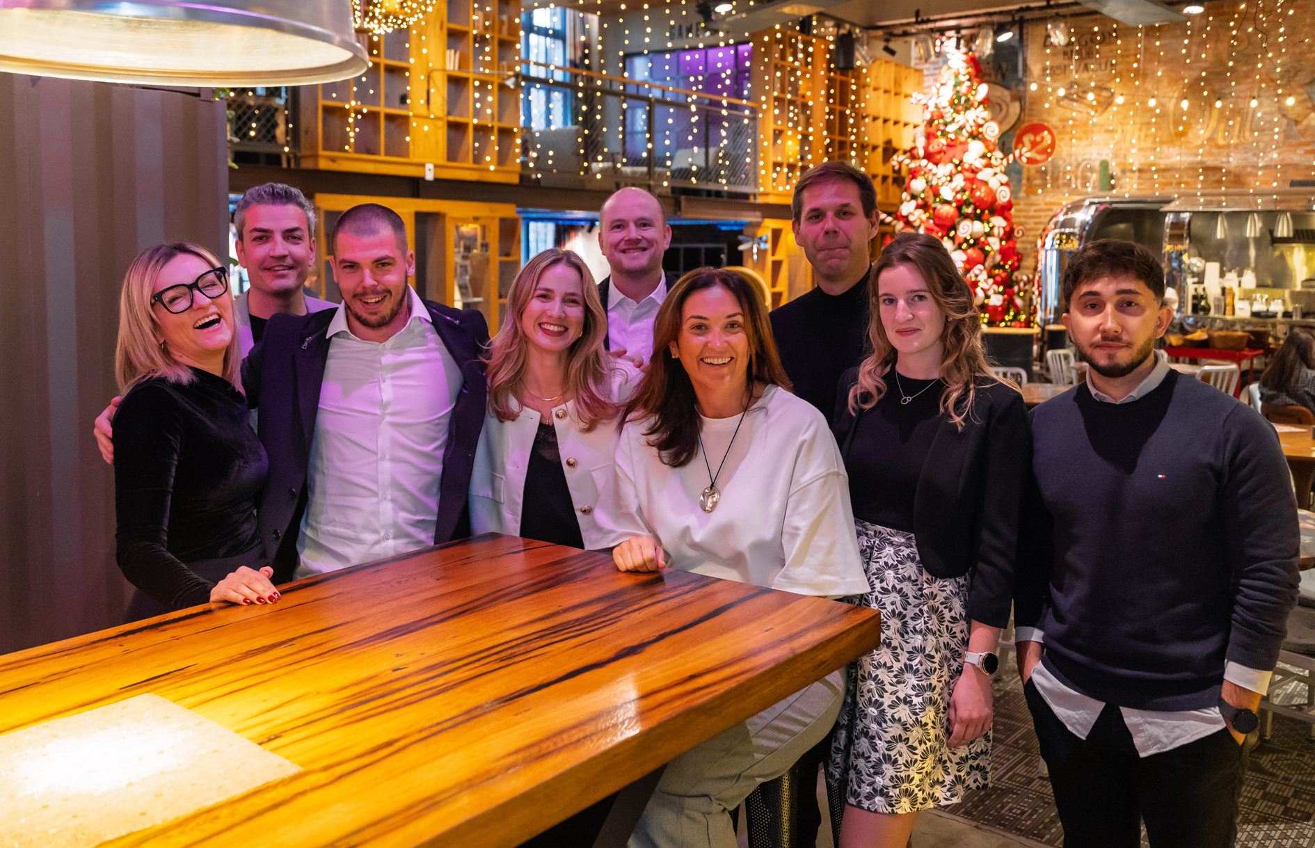
Kliping has never been, and never will be, “just technology.” We are a team of people, consultants, and analysts who understand the media, the communication environment, and clients’ goals. We help our clients understand how the public sees them, whether through media presence, responses to campaigns, analyses of the competitive environment, or the broader context of current developments. With accuracy, responsiveness, and a personal approach, we provide information that is not only collected, but also useful.
That is why the new identity is not merely a visual change. It is an expression of what we have already been living for some time: that we are developing, listening to clients, introducing new technologies, and upgrading our services, while remaining faithful to the values on which we have built trust. We want the new identity to show immediately that we are still the same in our essence, while also being more modern, bolder, and ready for the needs of today’s communicators.
If we had to summarize the redesign in one sentence, we would say: Kliping has an updated image, but the same commitment: to be a reliable, accurate, and responsive partner in understanding the media landscape.